Popular Post TitansGuru Posted March 13 Popular Post Report Share Posted March 13 Reminds me of a mix of the Dolphins, Bills, and Oilers uniforms in a really positive way. titanruss, SuperFreak90, Titandan, and 2 others 5 Link to post Share on other sites More sharing options...
MadMax Posted March 13 Report Share Posted March 13 Straight up... I don't hate them to the point of stopping following the team, but I hate they went away from two tone blue. Columbia blue is fine for alternate but the Titans should be Navy. The team hasn't been the Oilers since 1998. Full stop. Also, the new logo is meh at best. The white on white helmets are bad. Very bad. I don't get the TN or NT or whatever the hell it is. Sure, TN is abbreviation for Tennessee, but the way the logo is laid out, it looks like it should be the Nashville Titans, same as the NP is Nashville Predators. I hope merch sales go into the shitter. I'll be disappointed there too. Fry, prometheus, Hyperion, and 1 other 2 2 Link to post Share on other sites More sharing options...
TheChosenTitan Posted March 13 Report Share Posted March 13 Merch is up now too CreepingDeath, Supernope, and KogaShuko 2 1 Link to post Share on other sites More sharing options...
Popular Post Mercalius Posted March 13 Popular Post Report Share Posted March 13 FWIW league wide fans on social media think we hit a home run. Justafan, KogaShuko, titanskick8851, and 6 others 9 Link to post Share on other sites More sharing options...
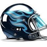
jtworsley Posted March 13 Report Share Posted March 13 Losing the flames is such an unforced error though MadMax, and Jamalisms 1 1 Link to post Share on other sites More sharing options...
Popular Post Supernope Posted March 13 Popular Post Report Share Posted March 13 1 minute ago, TheChosenTitan said: Merch is up now too I'm in SuperFreak90, CreepingDeath, KogaShuko, and 12 others 14 1 Link to post Share on other sites More sharing options...
VaTitan Posted March 13 Report Share Posted March 13 Our old uni's and logo were objectively one of the worst in the league.... this is a massive upgrade. Everyone I know who's seen it loves it. Fry 1 Link to post Share on other sites More sharing options...
CreepingDeath Posted March 13 Report Share Posted March 13 Kuharsky posted these details on the link I shared: Paul Kuharsky Quote A new secondary logo replaces the sword: an interlocked T and N under a three-star arch inside a football outline. It can be read as TN for Tennessee or NT for Nashville, Tenn. But it’s not on the uniform. pamo9 1 Link to post Share on other sites More sharing options...
heyitsmeallen Posted March 13 Report Share Posted March 13 I love them Titandan 1 Link to post Share on other sites More sharing options...
OzTitan Posted March 13 Report Share Posted March 13 (edited) 3 minutes ago, jtworsley said: Losing the flames is such an unforced error though were there still those flamehead fans at games lately? what will they do now Edited March 13 by OzTitan Link to post Share on other sites More sharing options...
rns90 Posted March 13 Report Share Posted March 13 1 minute ago, Supernope said: I'm in lol $150. That thing is going to get clearanced out when he gets cut Supernope 1 Link to post Share on other sites More sharing options...
Starkiller Posted March 13 Report Share Posted March 13 The unis are nice The logos are shit Link to post Share on other sites More sharing options...
Callidus Posted March 13 Report Share Posted March 13 (edited) 1 hour ago, TitansGuru said: New alt logo? Great, we went from tesla to kai Trump. This has to be a simulation. Edited March 13 by Callidus Somedude 1 Link to post Share on other sites More sharing options...
NashvilleNinja Posted March 13 Report Share Posted March 13 Coulda, shoulda... Link to post Share on other sites More sharing options...
CreepingDeath Posted March 13 Report Share Posted March 13 1 minute ago, OzTitan said: were there still those flamehead fans at games lately? what will they do now I hope they still wear them. I hope the fans keep the Greek stuff alive. Hyperion 1 Link to post Share on other sites More sharing options...

Recommended Posts
Join the conversation
You can post now and register later. If you have an account, sign in now to post with your account.