Callidus Posted March 12 Report Share Posted March 12 13 minutes ago, OzTitan said: Obviously some people were always going to hate a Oilers heavy redesign, and these are that. Some people obviously never liked the Oilers look to begin with so they're not going to like these either. This change is clearly a result of the very positive reception to the Oilers throwbacks in recent years. Maybe a touch of protectionism of the Oilers branding too, which has been under attack from some Houston entities over the years. Personally, I'm just glad they didn't half ass it with some gaudy ultra modern take on it. This is tasteful and being accused of being too plain or boring is a great sign to me. It could have been really really horrible. Will they stand the test of time? honestly I think the team success going forward is more influential, sometimes redesigns are used to energize a lapsing fanbase *cough*. But generally speaking a complete refresh typically lasts at least a decade or so. I give it two or three years before they remove or move the stars. The rest of it will likely grow on people who are not thrilled with it atm. Link to post Share on other sites More sharing options...
titanruss Posted March 12 Report Share Posted March 12 7 minutes ago, TampaTitan said: I'm still confused as to where the stars are. In the leaked player photos they're nowhere to be found like they are in that photo of the one on the hanger in front of the dudes pantry lol. Maybe they are actually more under the armpit like the Broncos jerseys. One thing I noticed about theirs is on the elite (on field version) and limited jerseys it's under the arm pit. On the cheaper game jeserys it's more on the front like the leaked photo from the guy overseas. you are confused because it doesnt make sense. same spot as the broncos jersey there. right in the tickle zone. Link to post Share on other sites More sharing options...
heyitsmeallen Posted March 12 Report Share Posted March 12 If those are the unis, I like them. Oilers style but showing love to Tennessee. Link to post Share on other sites More sharing options...
OzTitan Posted March 12 Report Share Posted March 12 6 minutes ago, Callidus said: I give it two or three years before they remove or move the stars. The rest of it will likely grow on people who are not thrilled with it atm. You might be right. The reference to the Broncos having some marks in the same spot from a few pages back makes me believe this is a "template" or sorts. I can't remember exactly but I want to say there was a time a decade or two ago where Nike came onboard as the uniform partner and most redesigns around that time happened to follow a template or sorts as well, and these change over the years. Link to post Share on other sites More sharing options...
TeamRamrod Posted March 12 Report Share Posted March 12 KogaShuko, Callidus, ChesterCopperpot1, and 1 other 1 2 1 Link to post Share on other sites More sharing options...
NashvilleNinja Posted March 12 Report Share Posted March 12 27 minutes ago, Jamalisms said: Guitar strings and stars are design aspects I could do without on guest consideration. Cool idea on the strings but also lame*. * - Until it grows on me This will be the theme song that accompanies the change. Link to post Share on other sites More sharing options...
NashvilleNinja Posted March 12 Report Share Posted March 12 2 minutes ago, TeamRamrod said: Is he gonna wear one because... you know... he wants to feel like a winner? Somedude 1 Link to post Share on other sites More sharing options...
heyitsmeallen Posted March 13 Report Share Posted March 13 It’s pretty disappointing that it’s not being streamed Jamalisms, and TheChosenTitan 2 Link to post Share on other sites More sharing options...
TheChosenTitan Posted March 13 Report Share Posted March 13 Just now, heyitsmeallen said: It’s pretty disappointing that it’s not being streamed Absolutely idiotic heyitsmeallen, and titanruss 2 Link to post Share on other sites More sharing options...
Hyperion Posted March 13 Report Share Posted March 13 The randomly placed tri-stars remind me of a stripper who has tattoos in random places. titanruss, and CreepingDeath 2 Link to post Share on other sites More sharing options...
SirLanceALot Posted March 13 Report Share Posted March 13 (edited) 2 minutes ago, heyitsmeallen said: It’s pretty disappointing that it’s not being streamed It’s not like it’s one of the biggest changes in Titans franchise history or anything… Edited March 13 by SirLanceALot heyitsmeallen 1 Link to post Share on other sites More sharing options...
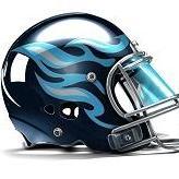
MadMax Posted March 13 Report Share Posted March 13 I hate 'em. I especially hate the all white helmets. Boring, boring, boring. Hyperion, prometheus, and Somedude 3 Link to post Share on other sites More sharing options...
SleepingTitan Posted March 13 Report Share Posted March 13 I love it It's a big fat W Link to post Share on other sites More sharing options...
SirLanceALot Posted March 13 Report Share Posted March 13 1 minute ago, MadMax said: I hate 'em. I especially hate the all white helmets. Boring, boring, boring. Simple and clean is always better headhunter, OzTitan, Legaltitan, and 1 other 3 1 Link to post Share on other sites More sharing options...
OzTitan Posted March 13 Report Share Posted March 13 3 minutes ago, heyitsmeallen said: It’s pretty disappointing that it’s not being streamed genuinely bizarre heyitsmeallen 1 Link to post Share on other sites More sharing options...

Recommended Posts
Join the conversation
You can post now and register later. If you have an account, sign in now to post with your account.