MadMax Posted Friday at 03:56 AM Report Share Posted Friday at 03:56 AM 6 minutes ago, Somedude said: Don't mind these but here be nice for the number to have a light blue outline. 100% Somedude 1 Link to post Share on other sites More sharing options...
Callidus Posted Friday at 03:58 AM Report Share Posted Friday at 03:58 AM 18 minutes ago, headhunter said: Glad it's not navy. That is atrocious The red does have nice pop but the baby blue just flows perfectly. Link to post Share on other sites More sharing options...
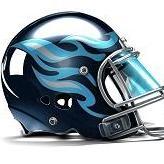
CreepingDeath Posted Friday at 04:05 AM Report Share Posted Friday at 04:05 AM Need to see the different face masks on players with the different uniform combos. Link to post Share on other sites More sharing options...
Somedude Posted Friday at 04:07 AM Report Share Posted Friday at 04:07 AM Over how it looks in general. Just hope they can win wearing these. As only a Titans fan never an Oilers fan. Nothing but disdain for the years Titans wore light blue as it was the worst years the Titans had in general. Hope history does not repeat. MadMax, and prometheus 2 Link to post Share on other sites More sharing options...
TheBukafax Posted Friday at 04:10 AM Report Share Posted Friday at 04:10 AM I will say this is branding I’ll be happy to wear. The home jerseys are such a massive upgrade over the last piece of shit. CreepingDeath, Titandan, and Omar 3 Link to post Share on other sites More sharing options...
Lantern Posted Friday at 04:28 AM Report Share Posted Friday at 04:28 AM if we had used the secondary logo without the odd football outline on the helmet then it would be a home run to me. I still really like what they did here. Link to post Share on other sites More sharing options...
scine09 Posted Friday at 04:39 AM Report Share Posted Friday at 04:39 AM The stars aren't as bad seeing them on players. Not as noticeable. Link to post Share on other sites More sharing options...
scine09 Posted Friday at 04:39 AM Report Share Posted Friday at 04:39 AM 3 hours ago, rns90 said: @scine09does this look familiar to you in any way? Nope, what does it remind you of? Link to post Share on other sites More sharing options...
NashvilleNinja Posted Friday at 04:42 AM Report Share Posted Friday at 04:42 AM 18 minutes ago, Lantern said: if we had used the secondary logo without the odd football outline on the helmet then it would be a home run to me. I still really like what they did here. Link to post Share on other sites More sharing options...
Lantern Posted Friday at 04:47 AM Report Share Posted Friday at 04:47 AM how about this? Link to post Share on other sites More sharing options...
Somedude Posted Friday at 04:56 AM Report Share Posted Friday at 04:56 AM So when is the rematch of the Titans and Bills in the playoffs that replicates 1992 but in reverse? Link to post Share on other sites More sharing options...
AussieTitanFan08 Posted Friday at 05:05 AM Report Share Posted Friday at 05:05 AM Lantern, and heyitsmeallen 1 1 Link to post Share on other sites More sharing options...
Hyperion Posted Friday at 05:09 AM Report Share Posted Friday at 05:09 AM The word marks are awful. Why are there two of them?The TN logo decent but how much better would it have been of they inserted the Parthenon, a sword with an olive branch, anything Greek motif instead? freakingeek, prometheus, Callidus, and 1 other 4 Link to post Share on other sites More sharing options...
Lantern Posted Friday at 05:25 AM Report Share Posted Friday at 05:25 AM 19 minutes ago, AussieTitanFan08 said: This makes me want to run through a wall. IsntLifeFunny, ballhawk, and TheChosenTitan 3 Link to post Share on other sites More sharing options...
NashvilleNinja Posted Friday at 05:38 AM Report Share Posted Friday at 05:38 AM 32 minutes ago, AussieTitanFan08 said: Should have live streamed this. They need to be questioned about it. TheChosenTitan 1 Link to post Share on other sites More sharing options...

Recommended Posts
Join the conversation
You can post now and register later. If you have an account, sign in now to post with your account.